The layout and design that I used for this project were due to its simplicity and easy to read style. I had gone through several different themes but none of them came close to the cleanness of the example project page that we have seen. It was an effective, interesting, clean and minimalist design that I thoroughly enjoyed. I am glad that the theme that I used worked well with my project and navigation.
I created seven different menu items, starting with introduction and ending with the “About” menu that goes through the project in a chronological order, from the beginning to the conclusion and ending with the bibliography and the “About” section.
I’ve stuck mainly to the black and white theme, for two reasons. One, this project talks a great deal about a horrible time in our history, and I think adding any colorful features to the page would kind of go against the overall “feel” of the website and project. Two, since this is a project about history in a history class, I thought that the black and white theme accommodates this project particularly well.
I did face some challenges during the development of this project. The initial research question in my proposal was not very well worded which put me in a tough situation when I had to actually begin research for this project. Therefore, I had to make a slight adjustment that changed the wording, without changing the overall purpose of the initial research question from the proposal.
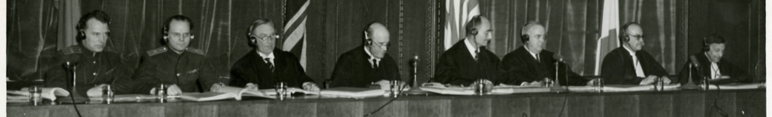
The only image that I added throughout the page was under the trial menu. The remaining pictures I added into my timeline. I decided to only have one picture on the page to keep inline with the “clean” theme that I’ve had throughout the project. All other pictures, including the required ones were inserted into the timeline and properly cited in the bibliography page.