This is the space where I explain myself, and it’s going to be broken down into sections by subtopic, because I have a lot of explaining to do.
About the Dataset. . .
From my initial research question regarding the accuracy and applicability of the Salem Village versus Salem Town narrative of the Trials, I began working on my dataset. That seemed like the most logical step, because I assumed it would make drawing insights and conclusions more intuitive and create less work for me in the long run. I was right on that count, but the dataset came with its own challenges. I had to decide who to limit it to and then scour the internet and the appendices of library books for accurate, reliable sources that contained the biographical data I needed, and that was before I decided to expand my research to coding the accused witches into the “scorned”, “critic” and “other” status groups.
Ultimately, I decided to include only accused witches that were convicted or died in prison before trial. I reasoned that this would provide a broader and therefore more reliable sample to draw insights and conclusions from without committing me to the ambitious task of including all of the accused or indicted witches in the dataset, rather than a sample size consisting only of the 19 executed accused witches. This decision turned out to be fairly convenient, as it brought the sample size to 30, and ensured that a variety of different fates, as I coded them in the dataset, were included.
The most difficult decision regarding the dataset came when I realized I should expand my research not just to the accuracy and applicability of the Salem Village vs. Salem Town narrative, but try to apply that same geospatial reasoning to the current dataset and see what I came up with. While the discovery of the two different categories was fairly intuitive once I gathered the necessary biographical data from various secondary sources, several accused witches included in the dataset could fit into either category. This required me to make some subjective judgement, particularly regarding the motivations of accusations against Elizabeth Proctor and Martha Corey.
On the one hand, both of these women’s husbands were critics of the proceedings, and witchcraft allegations tended to burn through families, as evidenced by the series of allegations against members of the Proctor, Carrier and Jacobs families. However, Martha Corey was a full-covenant member of the church, which should have afforded her some protection. She certainly was not an outcast, which barred her from the “scorned” category. Her husband however was once accused of beating an indentured servant to death, and those legal charges came back to haunt him (and, allegedly, the afflicted girls of Salem Village) when several girls claimed that the specter of a man murdered by Giles Corey spoke to them. One of my stipulations for placing an accused witch in the outcast or scorned category was prior allegations of witchcraft or other serious crimes against them or their family, as several writers and historians have made the risk of being related to a witch or criminal in witchcraft allegations fairly clear. So should she be “scorned”, despite her high standing, because of Giles’ previous allegations, or should both Coreys be considered critics for their defense of Rebecca Nurse?
Elizabeth Proctor posed another similar dilemma. Her grandmother was a Quaker, and seems to have practiced some kind of folk healing. These practices eventually culminated in witchcraft allegations against Proctor’s grandmother. The Wardwells, a family of Quakers, were also accused in 1692. However, none of the sources I found indicated that Elizabeth Proctor was anything but a respectable farm wife. Her husband, on the other hand, was an outspoken critic of the trials, and both of their sons were taken into custody and interrogated by court officials[1]Schiff, 2016. Ultimately, I relied on the contextual data within the dataset to categorize them. Neither Martha Corey nor Elizabeth Proctor were accused early in the trials. Indeed, they were accused months after the initial first wave of “scorned” Salem Villagers, who would have been known to the afflicted girls, who also tended to live in the village. Drawing from that, I surmised that their husbands’ criticism of the trials might have played more of a role in accusation against them than whatever lingering communal ire they accrued through previous familial legal altercations.
About the Layout of my narrative/research. . .
I spread my narrative – the figurative meat of this site – over four pages. I reworked my static homepage into my introduction, put my conclusion on its own page, and the body of the analysis on the analysis page. I also created a context page, with supplementary information that ties into the conclusion, my understanding of the data, and my findings. Between these four pages, I wrote more than 2,100 words. As per the instructor’s requirements, I also included a bibliography page, maintained an about page with my name and some minimal explanation for the conception of this site, and kept my blog and midterm pages in my main navigation menu.
To help make sense of the layout, I ordered the pages in the main navigation menu at the top of the page in the order in which I intended readers to read them. Few things annoy me more than a nonsensical navigation menu, and I wanted to make sure I didn’t inflict that pain on the instructor or anyone else who happens to stumble onto this site. Miscellaneous pages that were required but not directly necessary for my research (like the blog and the midterm timeline) were placed at the right-hand extreme of the page, so as not to detract attention from the more important research-laden pages on the left side of the menu. While I am aware that many cultures read from right to left, I reasoned that because this site is in English, most readers with a chance of understanding the information on this site would start at the left side of the menu anyway because they would be reading in English.
About those Digital Elements . . .
This project required a minimum of two original digital elements. Given the nature of the data I was working with, I wanted to make a timeline and an interactive map. As I explained in my visualizations blog post, I thought that a timeline like we made for the midterm would be the most efficient and concise way to summarize the theological and legal “heritage” of the Salem Witch Trials. That timeline lives on the context page.
As for the map, I initially hoped to make it time-sensitive. Such a map would be the ideal way to demonstrate the different “waves” of witchcraft allegations within the data’s geographic context as well as my categorization of the accused witches. In a time-sensitive map, it would be possible to directly visualize insights otherwise only gleaned from close reading of the dataset, such as the fact that the earliest accused witches were scorned individuals living in Salem Village and the accusations spread to other settlements and critical individuals later.
That was not the map I ended up creating, because I could not for the life of me get ArcGIS to accept a time-sensitive layer regardless of where I imported it from. Seriously, even their own example layer did not work in my map. So I eventually settled on an augmented heat map. That map lives on the analysis page, and adequately demonstrates the different hot spots indicated in the dataset (Salem Village and Andover), but also displays the individual accused witches color-coded by their category.
Just getting that map to function was an adventure. It turns out that ArcGIS only accepts longitude and latitude units to the second decimal place. That’s a problem when you’re dealing with a dataset including eleven people living in Salem Village, seven people living in Andover, and other smaller hot spots in Salem Town and Topsfield. To make each of the convicted witches in the dataset show up as individual points, I had to tweak the longitude and latitude so that each one had a unique value. Because this resulted in changes of just one number here and there, the points are largely accurate. However, this is why the some clustered plotted points appear in a straight line when zoomed in close enough.
I also included more than the requisite two historical images. As a communication major, I wanted to take advantage of the fact that so many historical images of the trials have long-since passed into the public domain to increase the visual engagement of this site. My primary means of including visual elements were my gallery of extant locations from the trials, which appears in the sidebar, and inserting artistic depictions of the trials into my introduction and analysis pages.
About the Aesthetic. . .
I wanted something clean, bold, and minimalist for this site, and I think my aesthetic choices delivered that. The background is clean and easy to read and I did not incorporate any harsh colors. I did this so that my visual elements would be the only break or distraction from the text. I also tried to strategically position these elements in a way that would engage readers and encourage them to interact with them. For example, aligning images to the left increases the chance that they will be seen and the captions will be read because readers’ eyes naturally return to the left side of a page or screen when reading in English.
I tried to maintain that grayscale minimalism in my original digital elements, hence the gray basemap on my map and the black/white color scheme on the timeline. My only regret in this regard is that I could not have more control over what colors my categories were associated with on the map. I did not particularly like any of the color options that were presented, and ended up choosing the black/purple/orange because I found it least disruptive to the existing purple of the heat map.
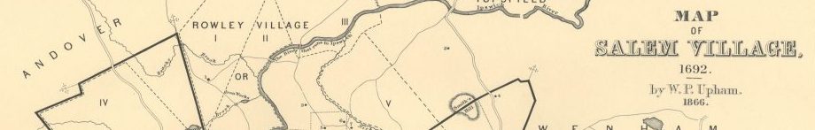
I also decided to use a section of the Upham map for my site’s header image. The inclusion of the Upham map ties in nicely to the geospatial focus of my research. Additionally, I chose a section of it that includes the names of other nearby settlements, such as Rowley and Wenham. This also speaks to the broader geographic scope of my research. The color of the map also fits nicely with the minimal aesthetic while still providing a nice pop of non-grayscale color.
About the Requirements . . .
As far as I know, I’ve built this site to meet all of the instructor’s requirements as laid out on our class site. Here’s a checklist of all the requirements as listed on our class site, just in case I’ve screwed up and made something difficult to find:
- A 1000-1500 word narrative, including an introduction, that contains my thesis, analysis and conclusion.
- At least two original digital elements
- At least two historical images related to my topic, which I can legally publish
- A reflection or “about” page that explains the decisions I made in building this site (this page)
- A separate comprehensive bibliography containing every single source that went into this final research site, organized by primary and secondary sources and formatted in Chicago style.
- My name, somewhere on this site
- Footnotes for citing[2]I used the footnotes plugin by ManFisher Medien Manufaktur
- A navigable menu
- Appropriate design choices